# Icon text
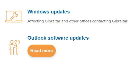
This block consists of an icon, text and an optional button and it's used to generate the following designs:
# Adding the block to a page
To add an Icon text block:
- Add or edit a page that uses the Gutenberg editor (e.g. Page or Post)
- Click to add a Gutenberg block (more on how to add a Gutenberg block can be found here)
- Find the block with the name Icon text (highlighted below) and,
- Click on it to add it
# Customising the block
Once you've added the block, you will be presented with all the configuration options for it which are explained in detail in the following sections.
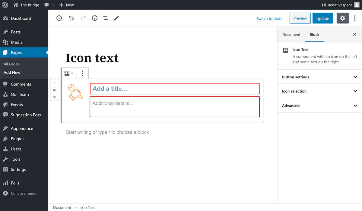
# Adding text
To add text to the right hand side of the icon, simply fill in the optional title and description fields highlighted below.
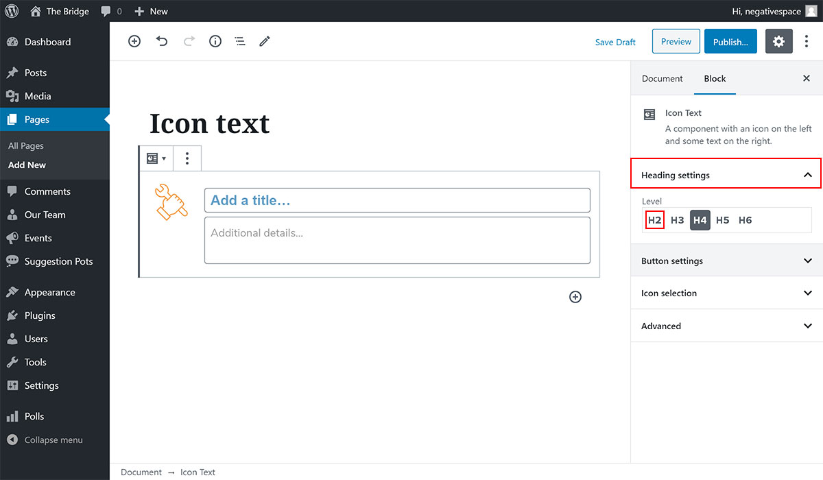
# Heading settings
The default heading (title) level is set to 4 (h4), but you can change it by expanding the Heading settings dropdown and choosing a heading level between 2-6 as shown below.
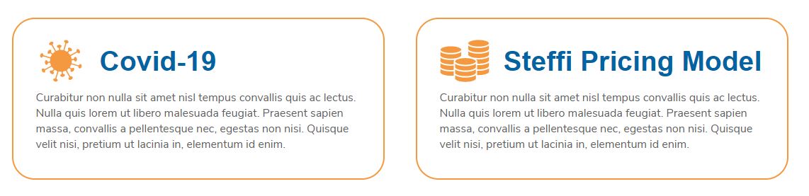
For example, the following blocks are using the Icon text block with a heading level 2 and with the additional information hidden.
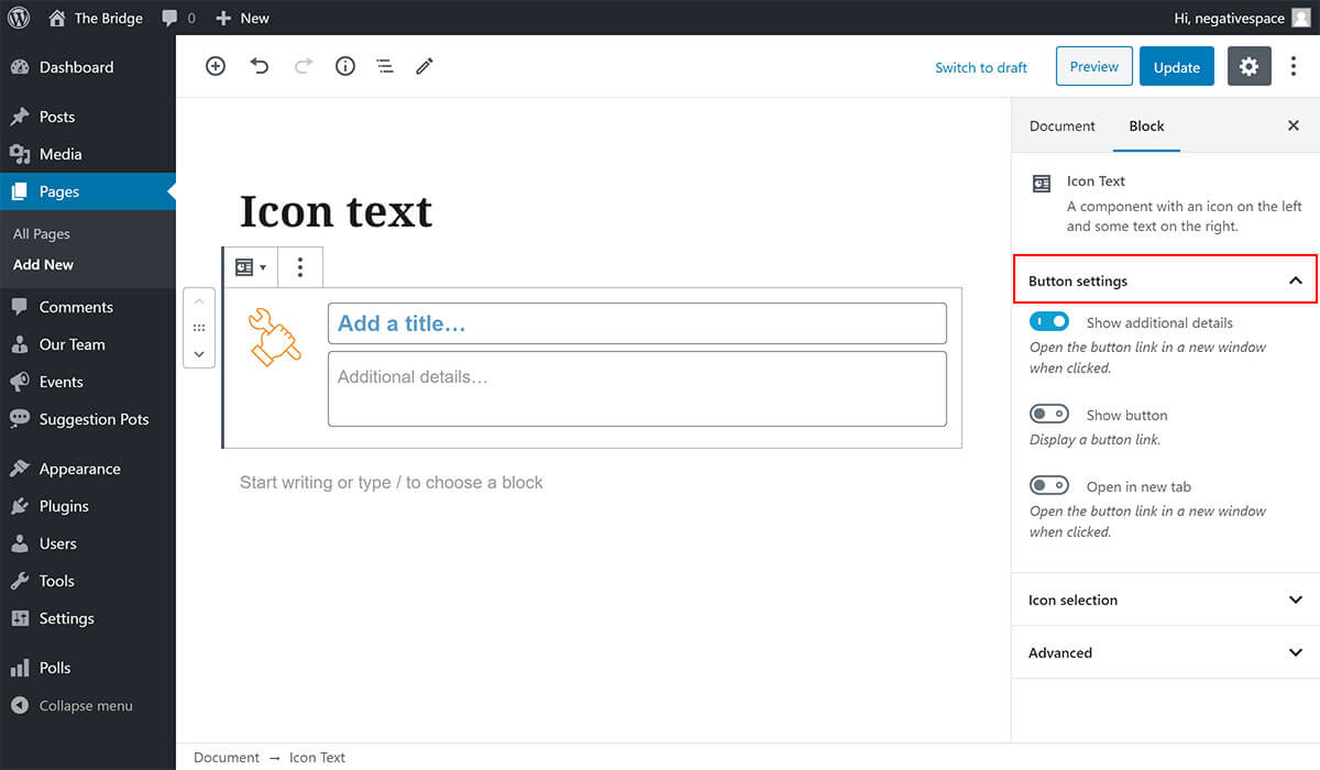
# Button settings
To add and configure a button, expand the Button settings dropdown menu highlighted below.
In this settings panel you can:
- Disable the Show additional details toggle to hide the description text and show the title and button only
- Enable the Show button toggle to show a button link under the text
- Enable the Open in new tab toggle to open the button link in a new window
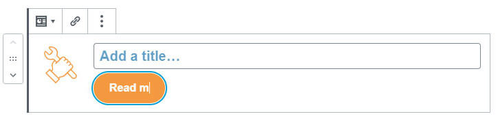
Note: If you have the Show button toggle enabled you can:
- change the button text by typing inside the button as shown below:
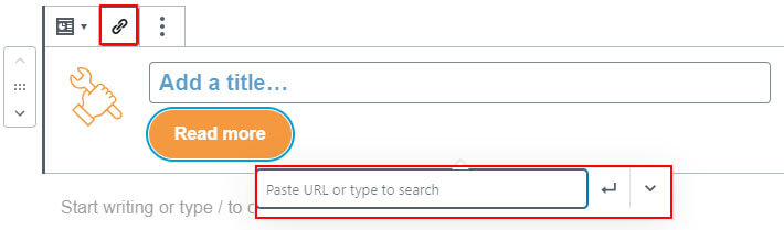
- set the URL that the button links to by clicking on the link icon button (highlighted below) and setting the URL in the popup (highlighted below).
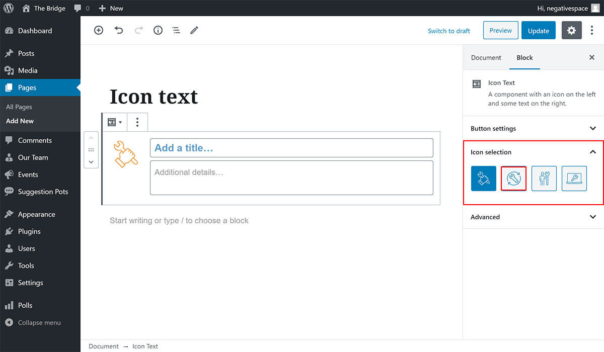
# Selecting an icon
To change the default icon selected for the block, simply expand the Icon selection dropdown and click on one of the predefined icons to select it (highlighted below).