# Custom layout using a Grid block
The Employee Intranet includes a custom Gutenberg block, called Grid, which can be used to create new layouts by splitting the nested blocks inside it to 1, 2 or 3 columns.
# Adding a Grid block
To add a Grid block:
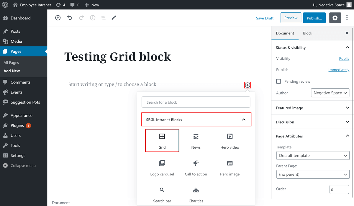
- Click on the plus button to add a Gutenberg block,
- Find the block with name Grid under the dropdown menu with name SBGL Intranet Blocks and
- Click on it to add it
# Configuring a Grid block
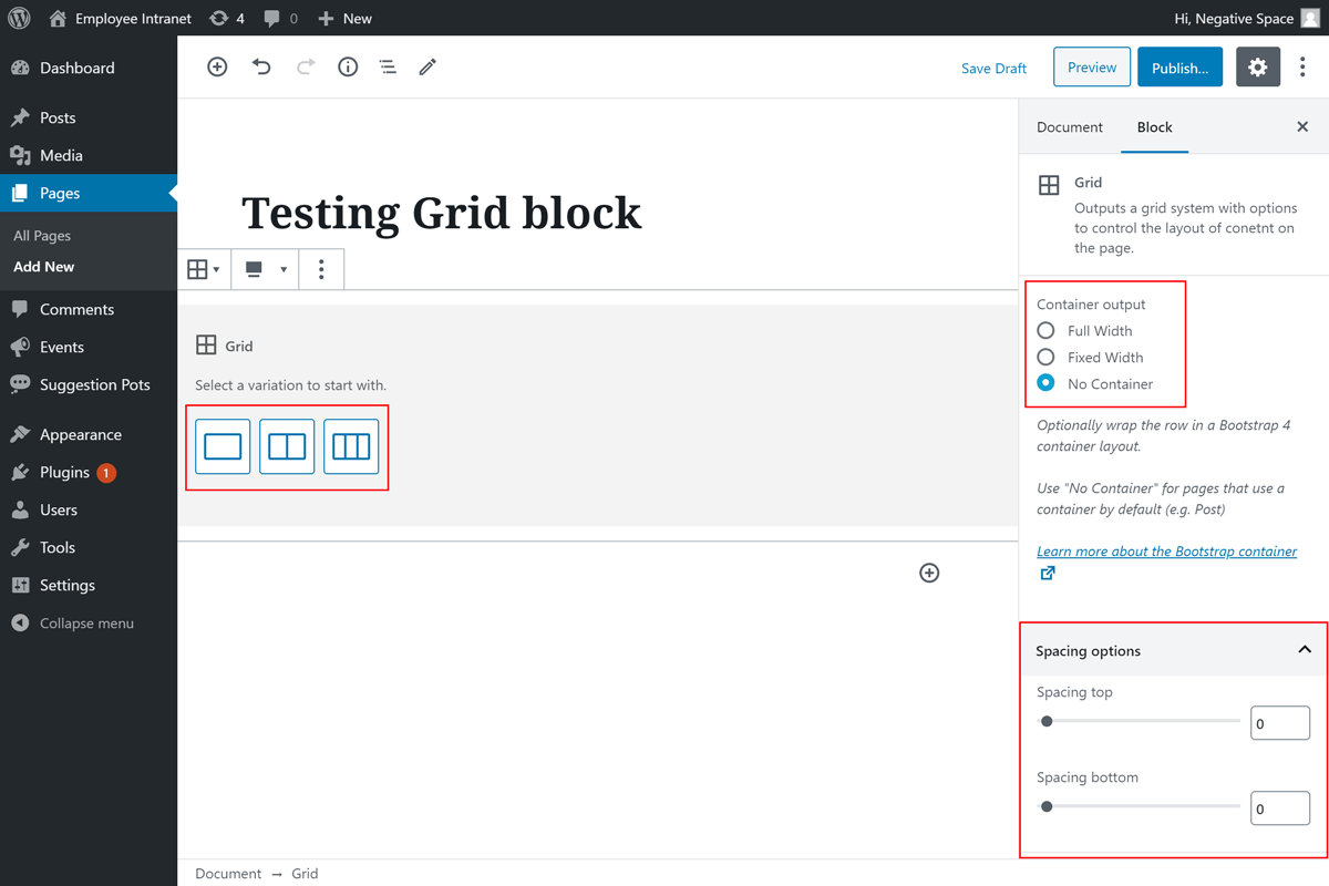
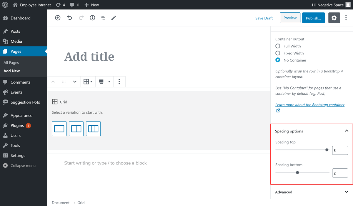
Once you add a Grid block, you will be given options to configure the container output, the number of columns and the top/bottom spacing of the grid, as highlighted below. These options are explained further in this section.
# Container output
In order to cater for the different layout requirements of the Employee Intranet design, the Grid block comes with three options for the container output, which are:
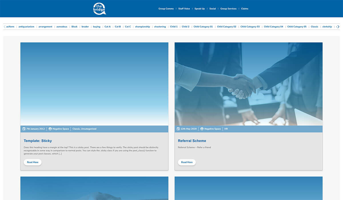
- Full width - adds a fluid Bootstrap container[1], which allows the grid columns to stretch to the full width of the page with default left and right spacing to prevent the content from touching the edges of the window. In the example below you can see a Page with a full width container and one column that contains the News Block.
- Fixed width - adds a fixed Bootstrap container[1], which keeps the nested blocks within a maximum width and aligned to the centre of the page. Most blocks in the Employee Forum are added to a fixed container in order to keep the text contained in the centre of the page and improve readability. In the example below you can see a Page with a fixed width container and one column that contains the News Block.
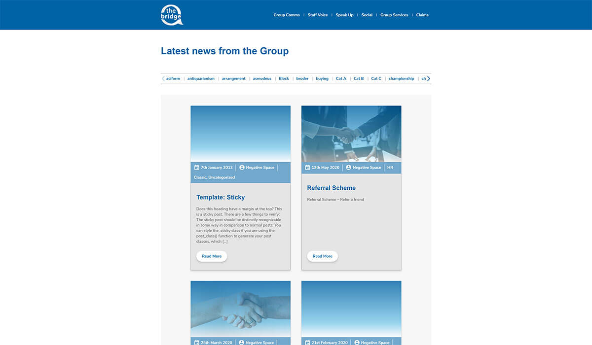
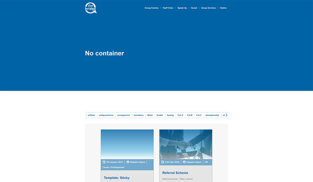
- No container - adds a Bootstrap row[2] that isn't nested inside a container. This is useful when trying to add columns to a layout that includes a default container (e.g. Post or Page Default Template). In the example below you can see a Page with the Default Template and a Grid with no container that contains the News block.
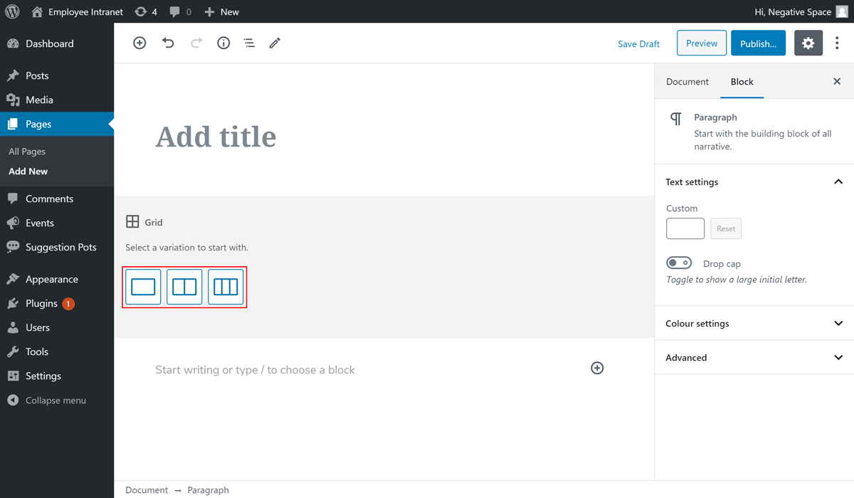
# Number of columns
When adding a Grid block the editor prompts you to select a variation to start with for your grid. These variations are the number of columns that the Grid block will split the content to. The options available are 1-3 as shown below. Clicking on an option will give you 1-3 slots (plus buttons) for nested Gutenberg blocks.
# Spacing top/bottom
The Gutenberg blocks in the Employee Forum are not opinionated when it comes to spacing top and bottom in order to prevent affecting the vertical layout of the page they're added to. As a result, the Grid block comes with spacing top & bottom options, which allows the editors to define the vertical spacing between blocks on each page.
These options are located under the Block tab of the Grid block and are set with sliders that range from 0 spacing to 5 times the theme default spacing, as highlighted below.
# Separators
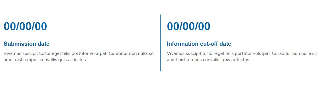
As of Phase 2 of the Intranet you can add an optional separator between columns, which is a vertical line (light/dark blue) that goes between the grid columns as shown in the example below.
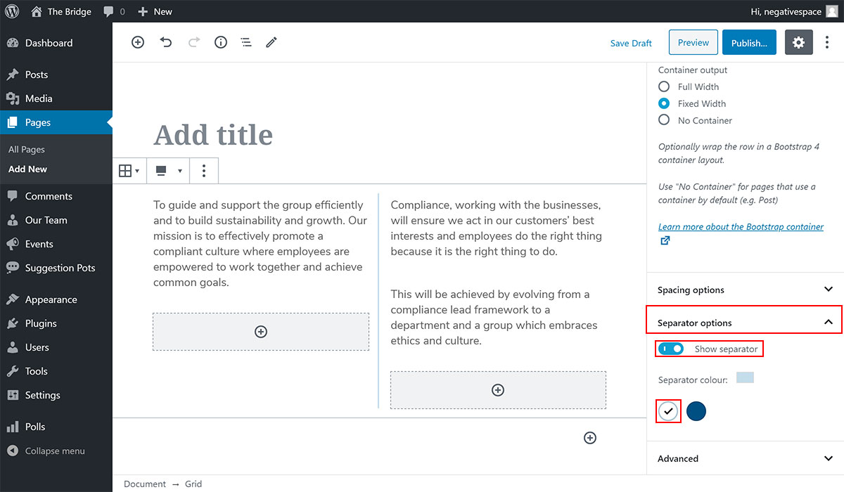
To add a separator:
- Select the Grid block
- Expand the Separator options dropdown (highlighted below)
- Enable the Show separator toggle (highlighted below)
- Set the separator colour by choosing from one of the predefined colours (highlighted below)
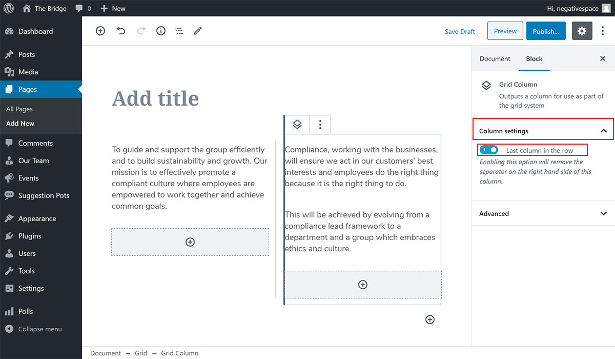
Note: Adding a separator to a Grid block that was created prior to the Phase 2 changes will add a separator after the last column as well. To remove the separator from the last column, simply:
- Select the respective column block
- Expand the Column settings dropdown (highlighted below)
- Enable the Last column in the row toggle (highlighted below)
# Adding another Gutenberg block inside a Grid block
Once you've selected the number of columns for your Grid block you will be presented with plus buttons that match the number of columns you selected. Click on each plus button to add a Gutenberg block. In the following screenshots you will see how to create a grid inside a hero image block and nest a search bar and three buttons using the Grid block to lay them out.
Step 1 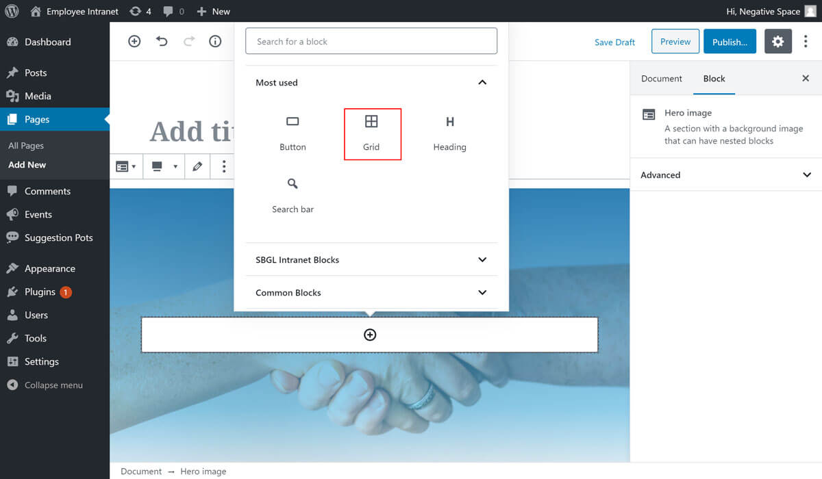
Step 2 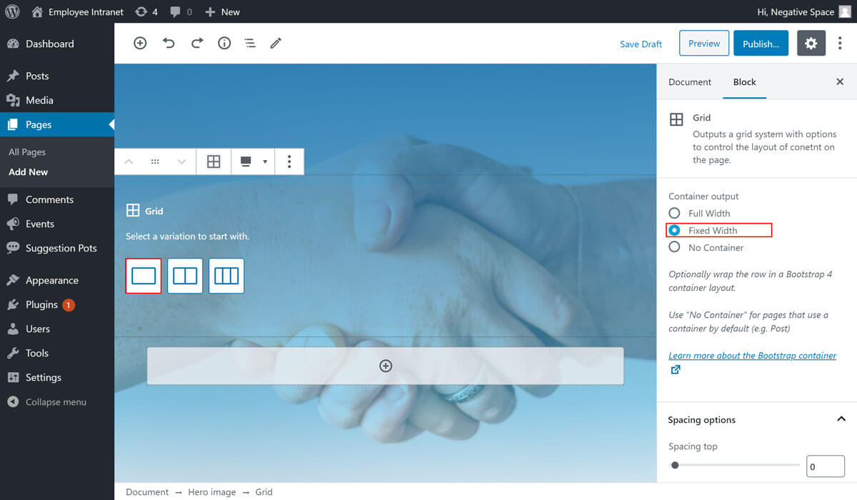
Step 3 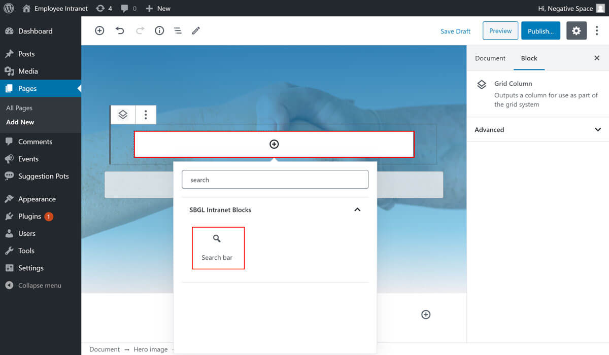
Step 4 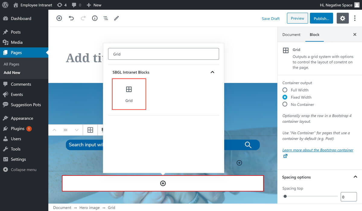
Step 5 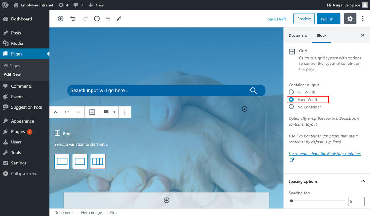
Step 6 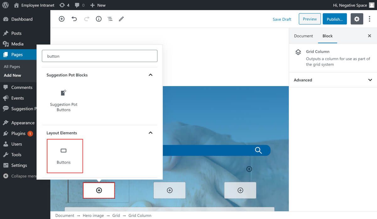
Step 7 
Result 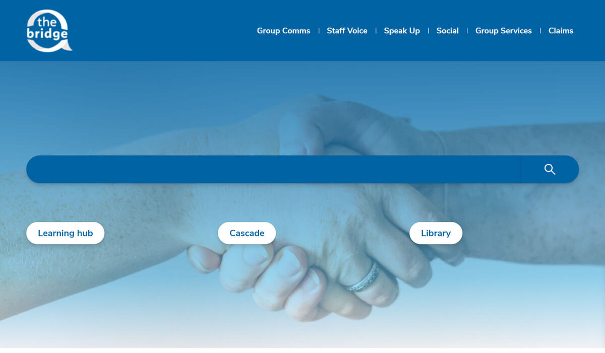
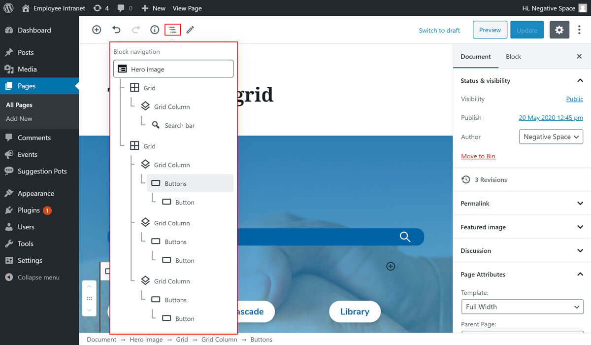
# Selecting the Grid block
If you ever need to go back to the configuration options of a Grid block or any other block, the easiest way to find to it is by:
- Clicking on the block editor navigation (highlighted below)
- Find your block in the hierarchy of blocks
- Click on its name in the hierarchy to select it